Case 01 · Brand Identity · T.J. Maxx · 2019–2022

One brand, five inputs.

When I joined T.J. Maxx, the stores and the website looked like two different brands. I merged the teams, then rebuilt the identity from the belief up: story, voice, design, photography and pattern, written as one system for the in-house team, brand partners and outside vendors.

Role
Executive Creative Director, Assistant Vice President
Scope
tjmaxx.com, social, video and 1,000+ stores
Team
30+ designers, writers, photographers and stylists
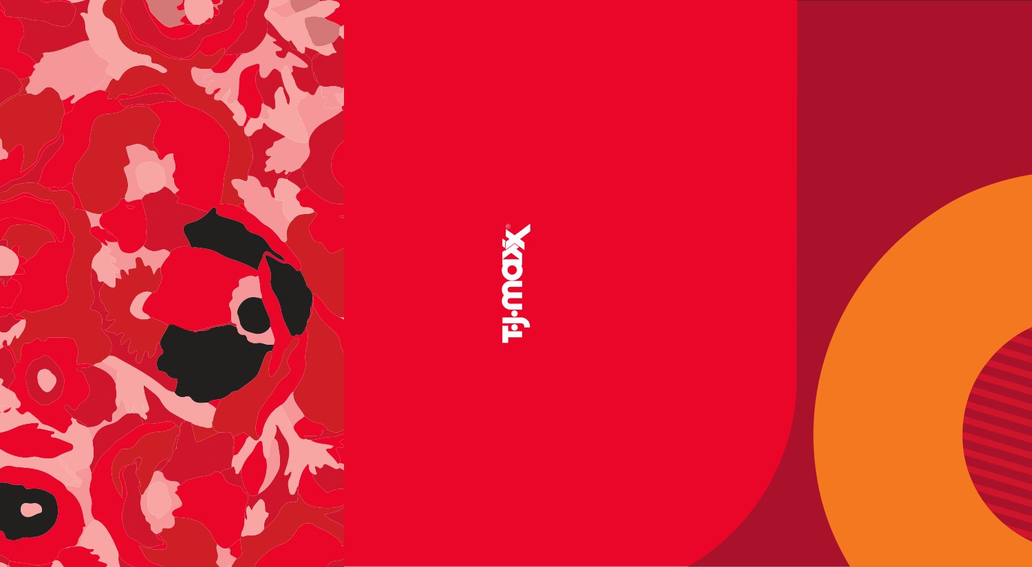
Maxx Story guide cover01Story Maxx Voice guide cover02Voice Maxx Design guide cover03Design Maxx Photo guide cover04Photography Maxx pattern in use05Pattern
01

Story: what the brand believes

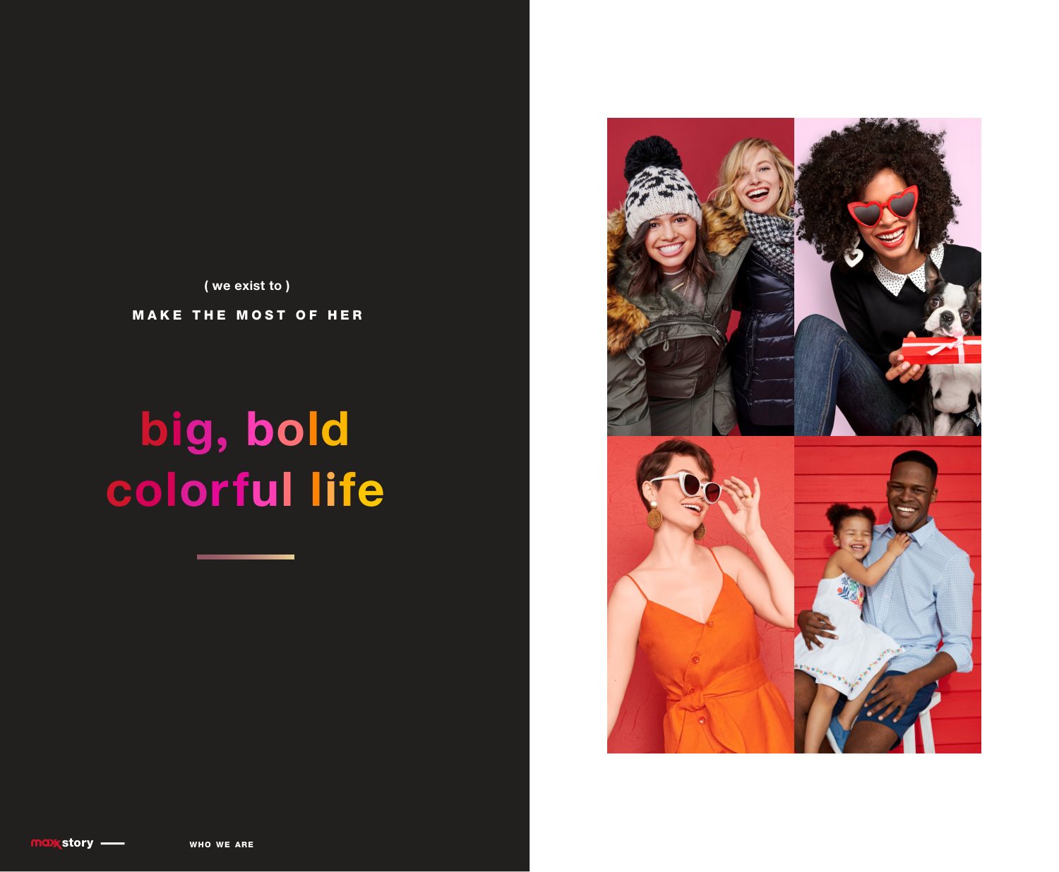
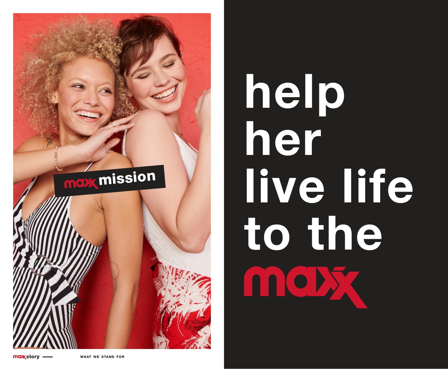
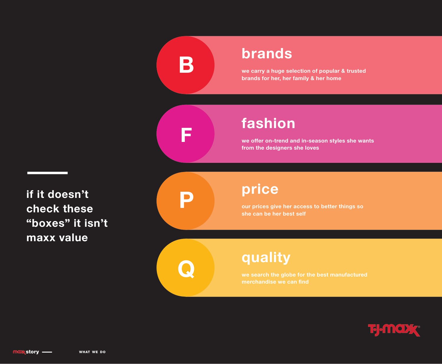
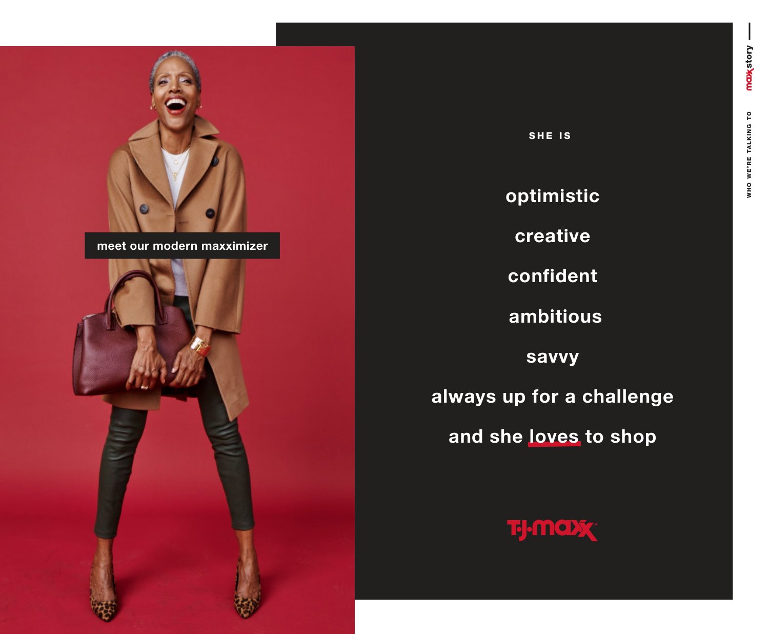
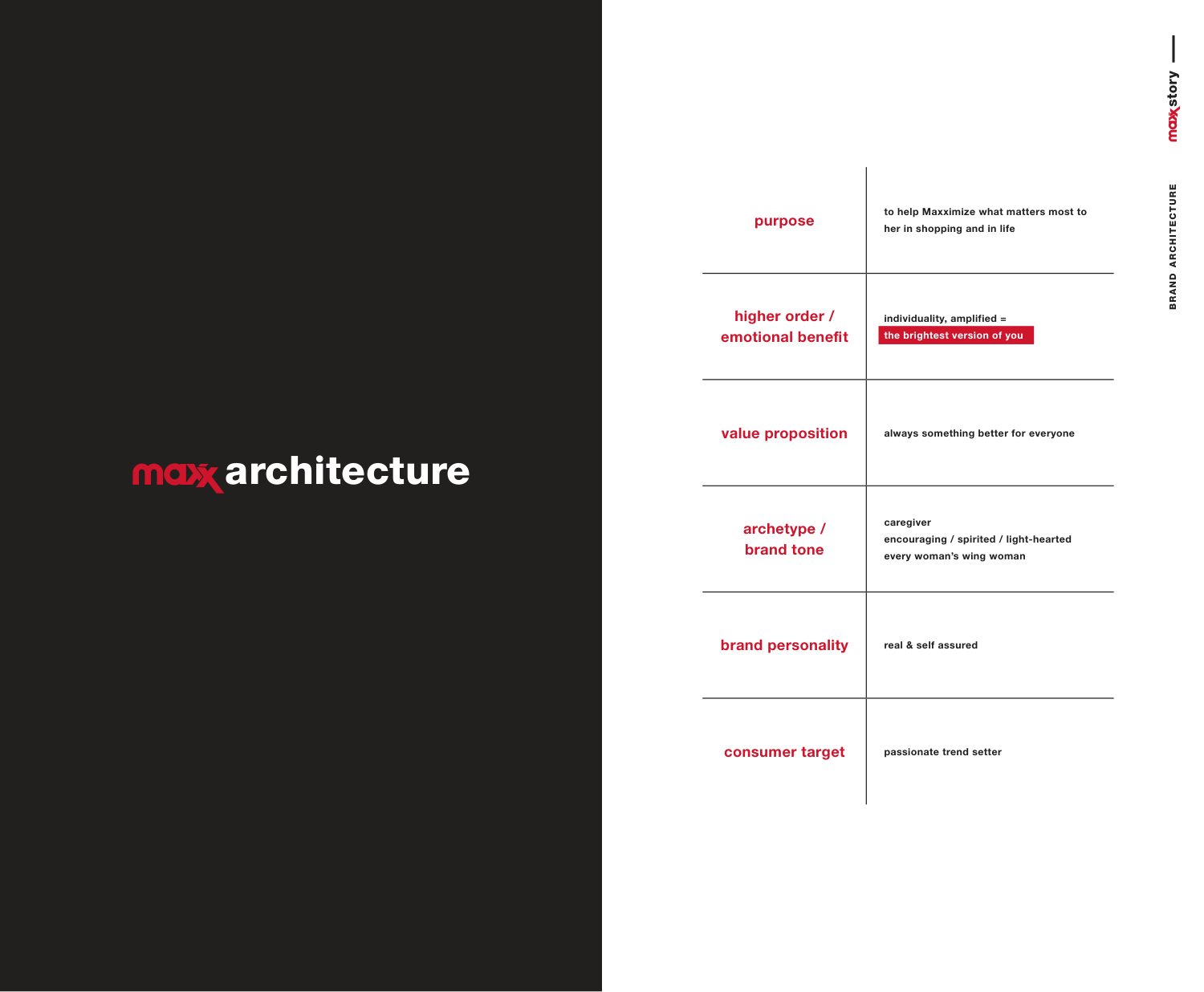
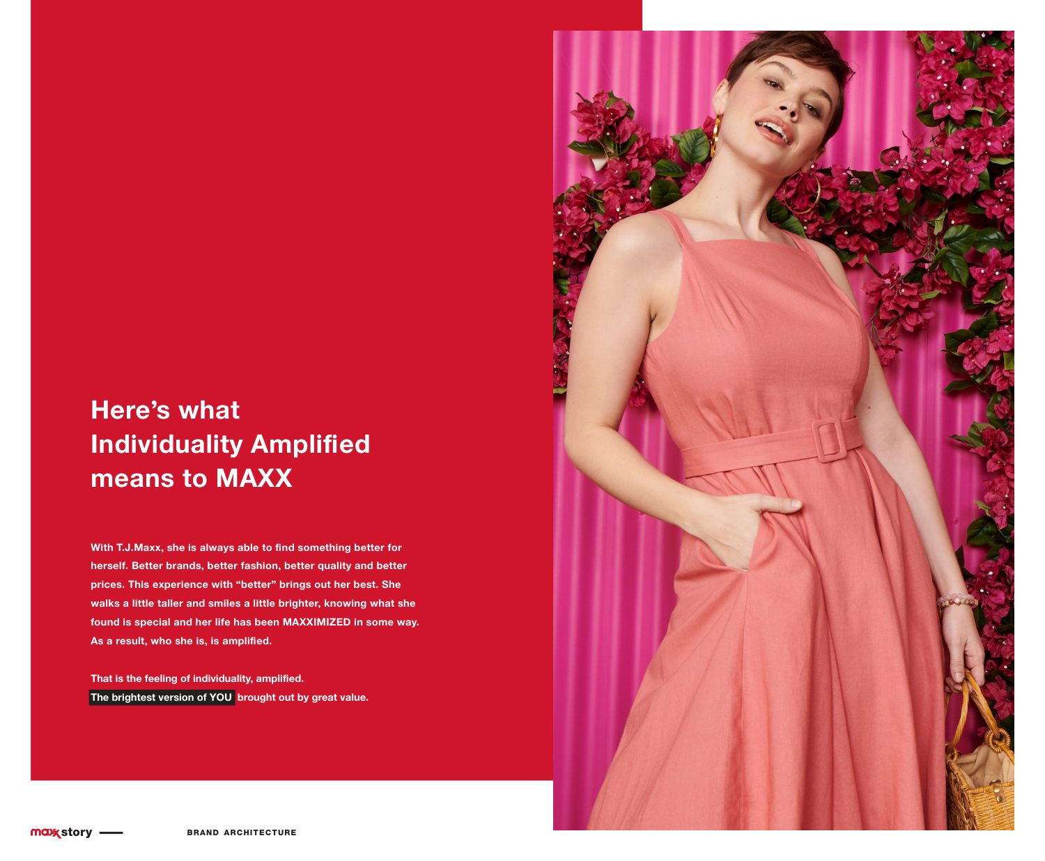
Before any design, one sentence everyone could repeat: help her live life to the maxx. The Maxx Story sets the mission, the four tests of value, who she is, and an architecture that ends in two words, individuality amplified.

Brand strategy · Positioning · Architecture
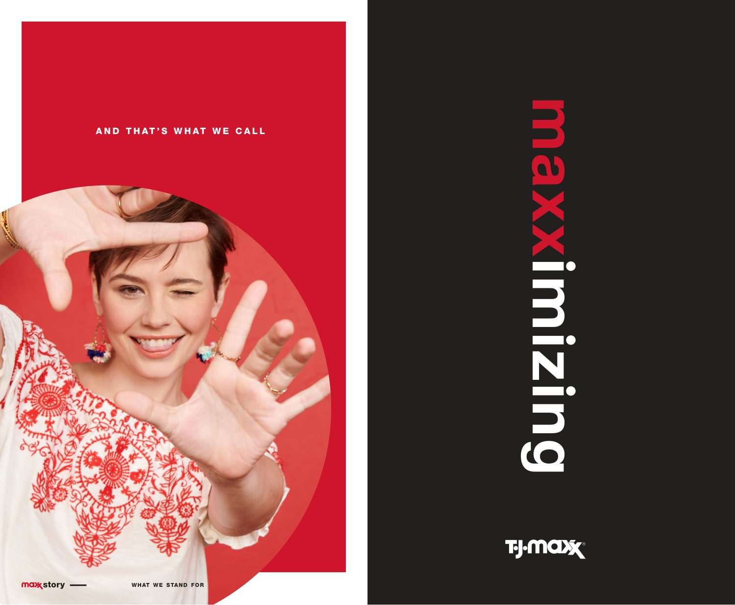
Maxx Story: big, bold colorful life Maxx mission: help her live life to the maxx The four tests of Maxx value: brands, fashion, price, quality Meet our modern maxximizer And that's what we call maxximizing Maxx brand architecture What individuality amplified means to Maxx
02

Voice: how it talks

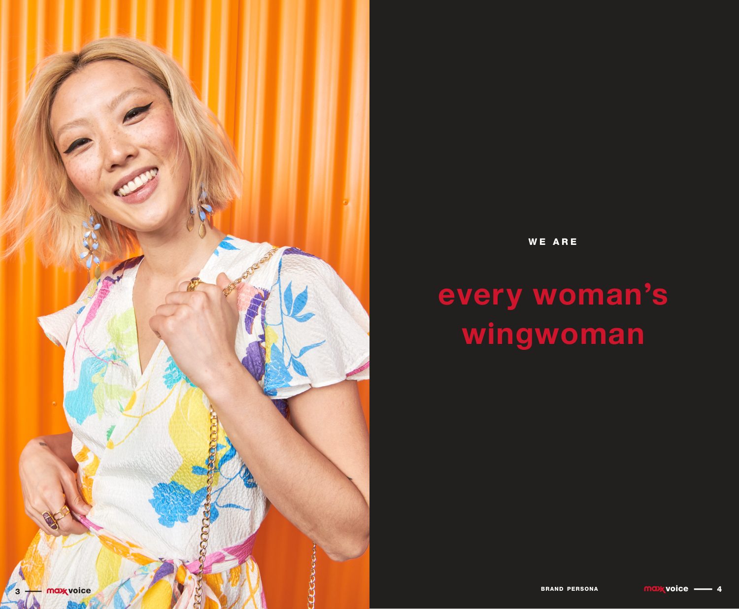
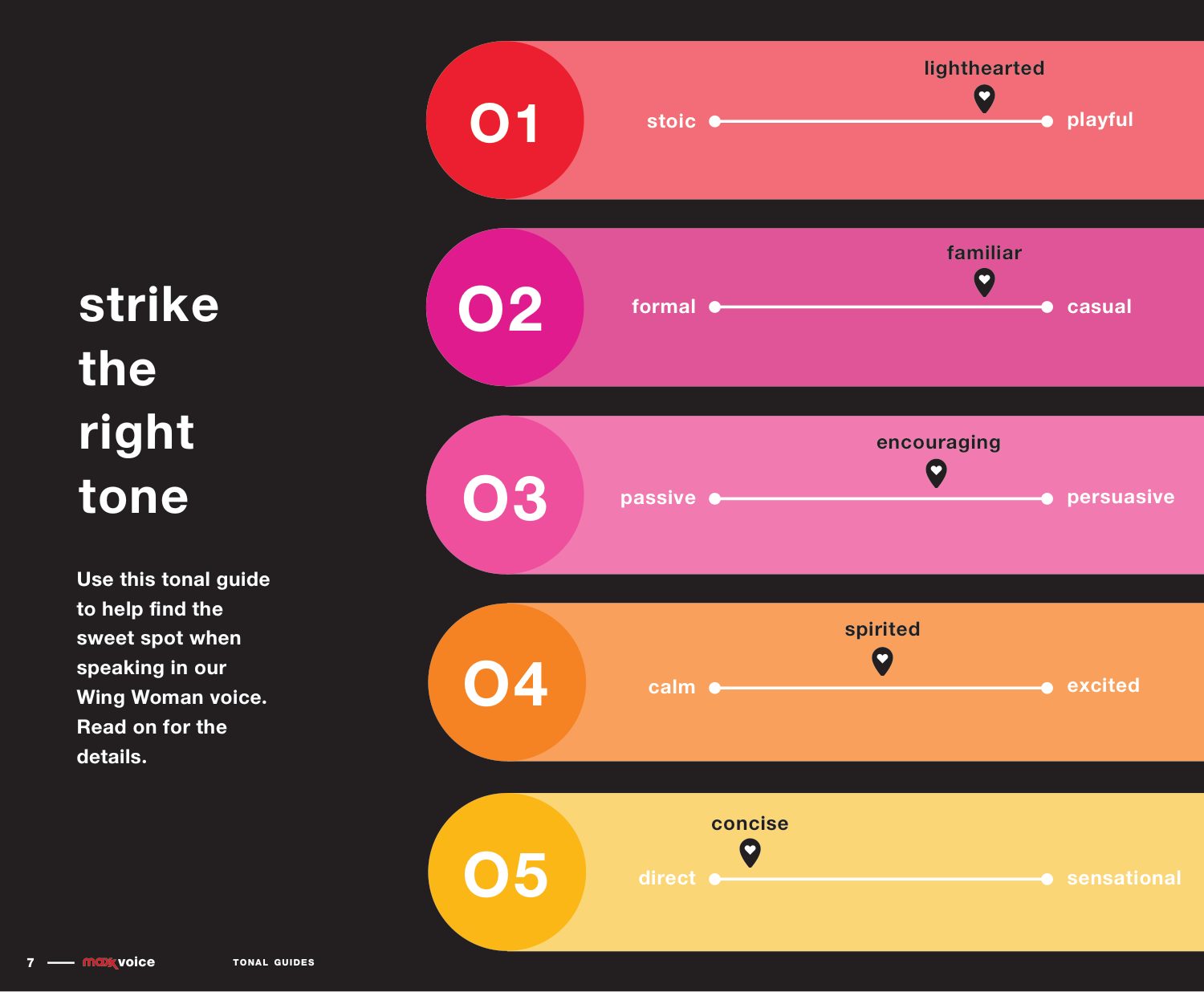
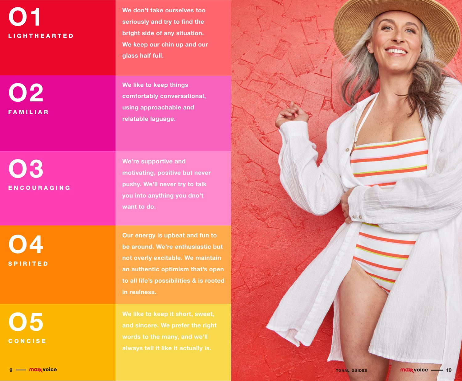
Every woman’s wingwoman. Five dials set the tone, so a store sign, a subject line and a social caption all sound like the same person.

Verbal identity · Tone of voice
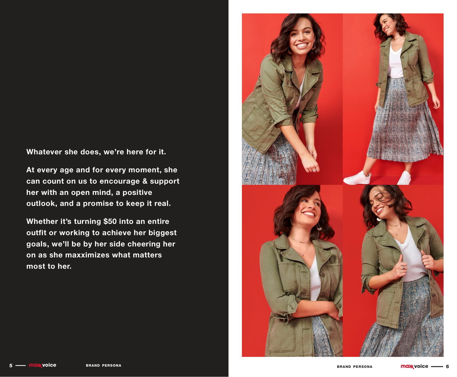
We are every woman's wingwoman Strike the right tone: five tonal sliders Lighthearted, familiar, encouraging, spirited, concise Brand persona
03

Design: how it looks

A 51-page guide built on three decisions: red comes first, one typeface is the signature, and every shape is cut from the logo.

Visual identity · Color · Typography · Graphic language

Mark and color

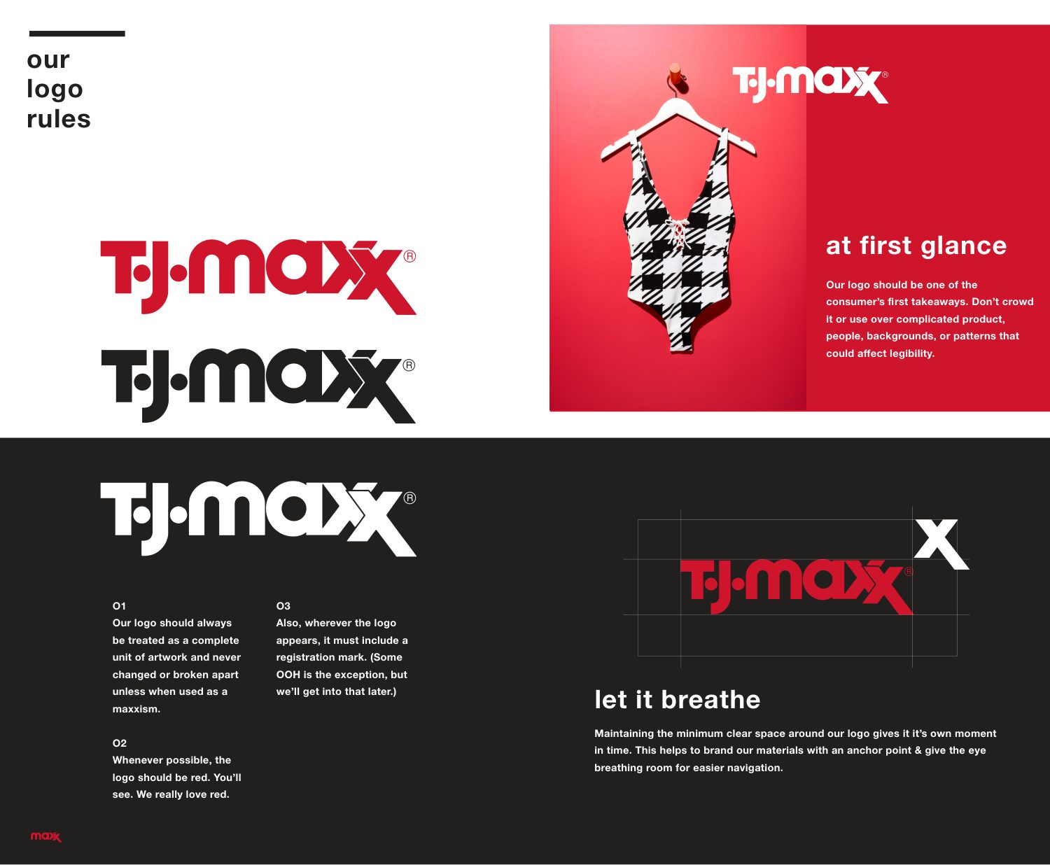
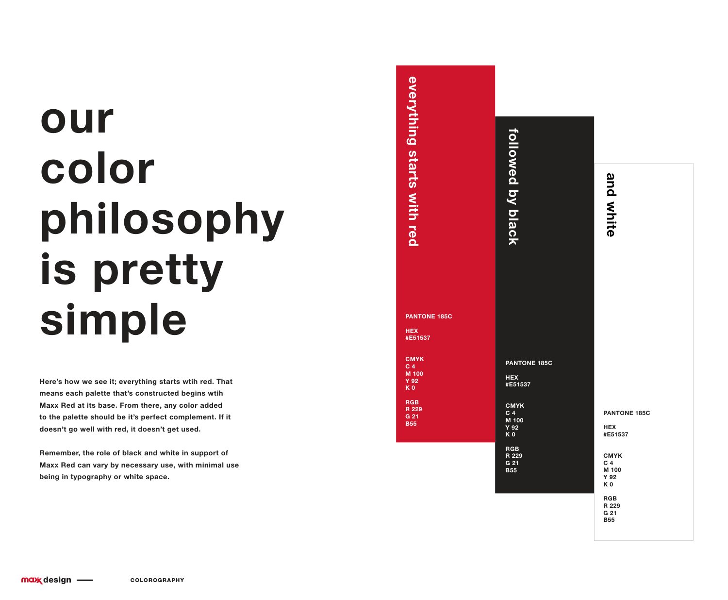
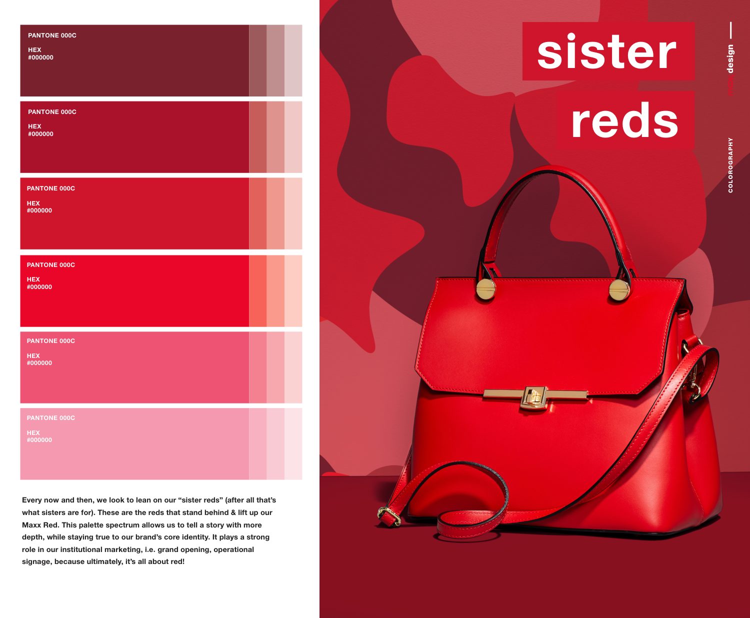
Everything starts with red, followed by black and white. A family of sister reds adds depth without leaving home.

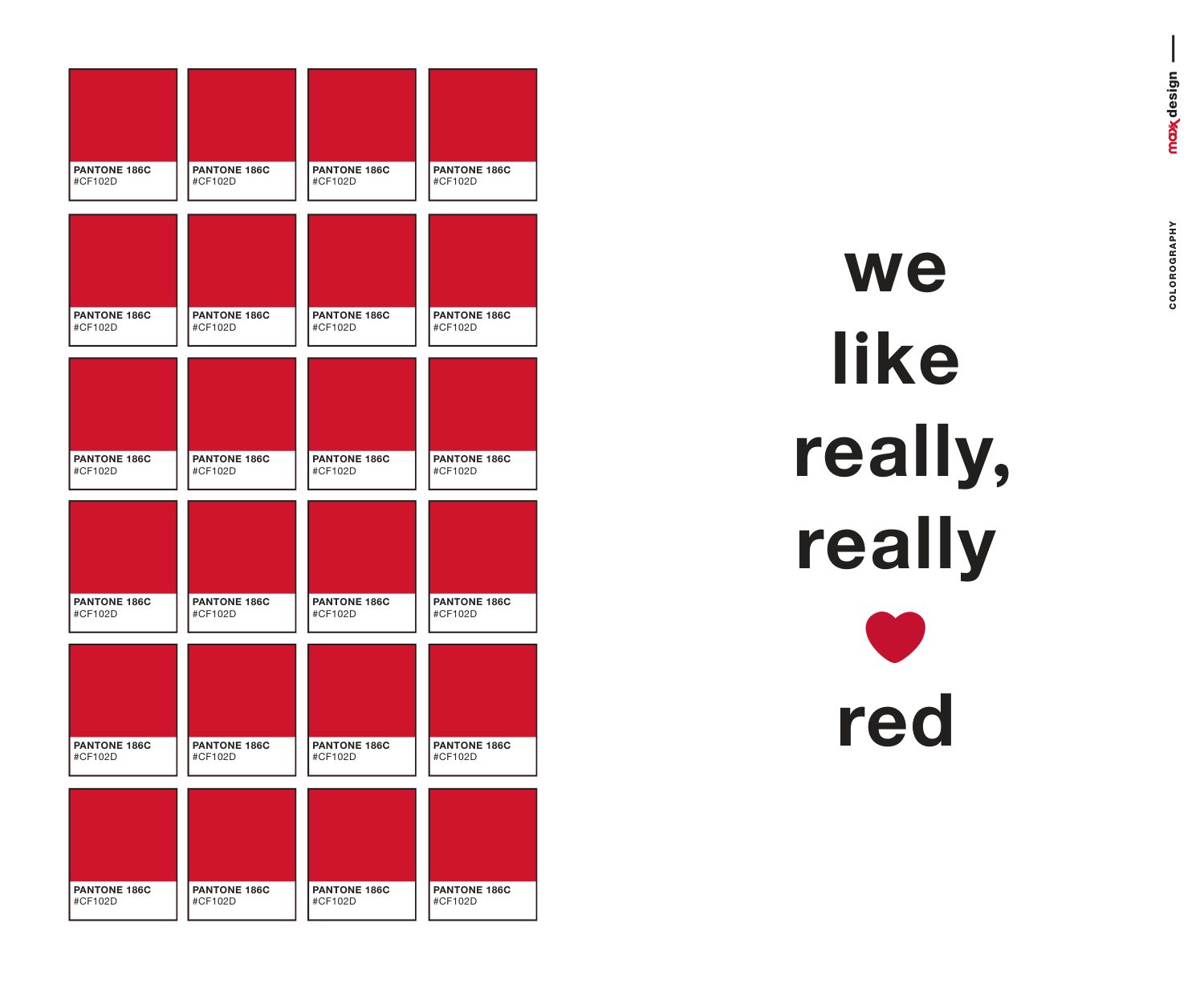
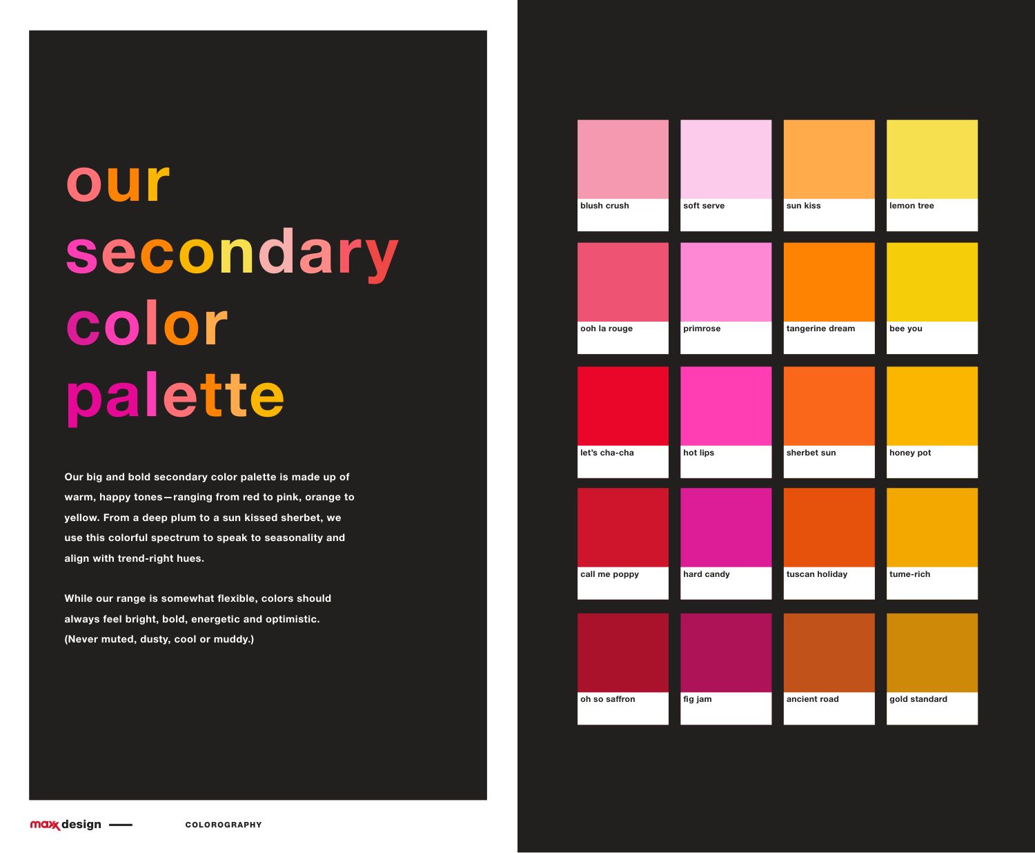
Logo rules Our color philosophy is pretty simple We like really, really red Sister reds Secondary color palette

Typography

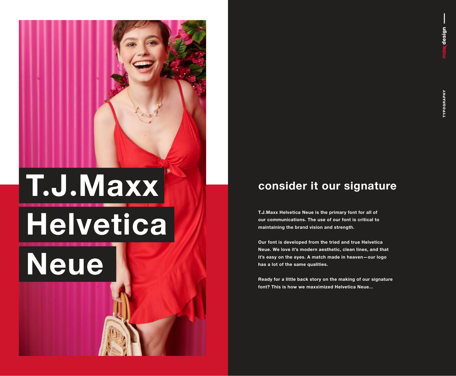
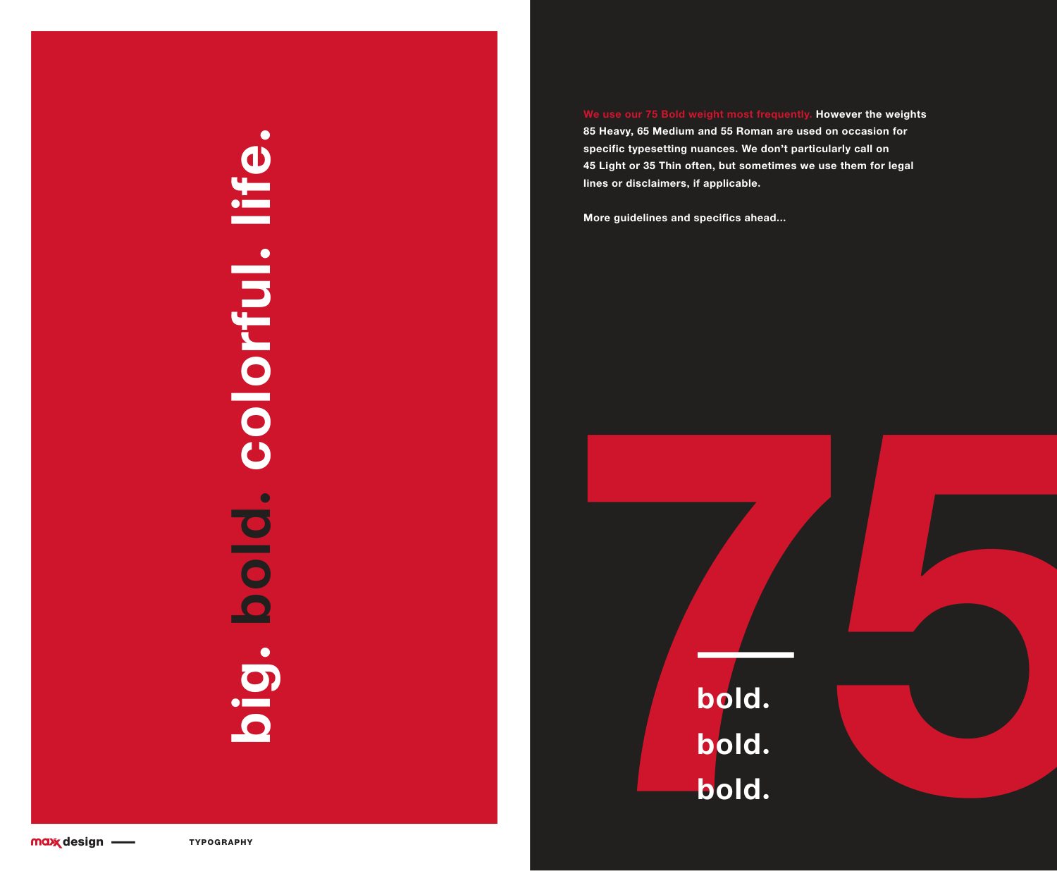
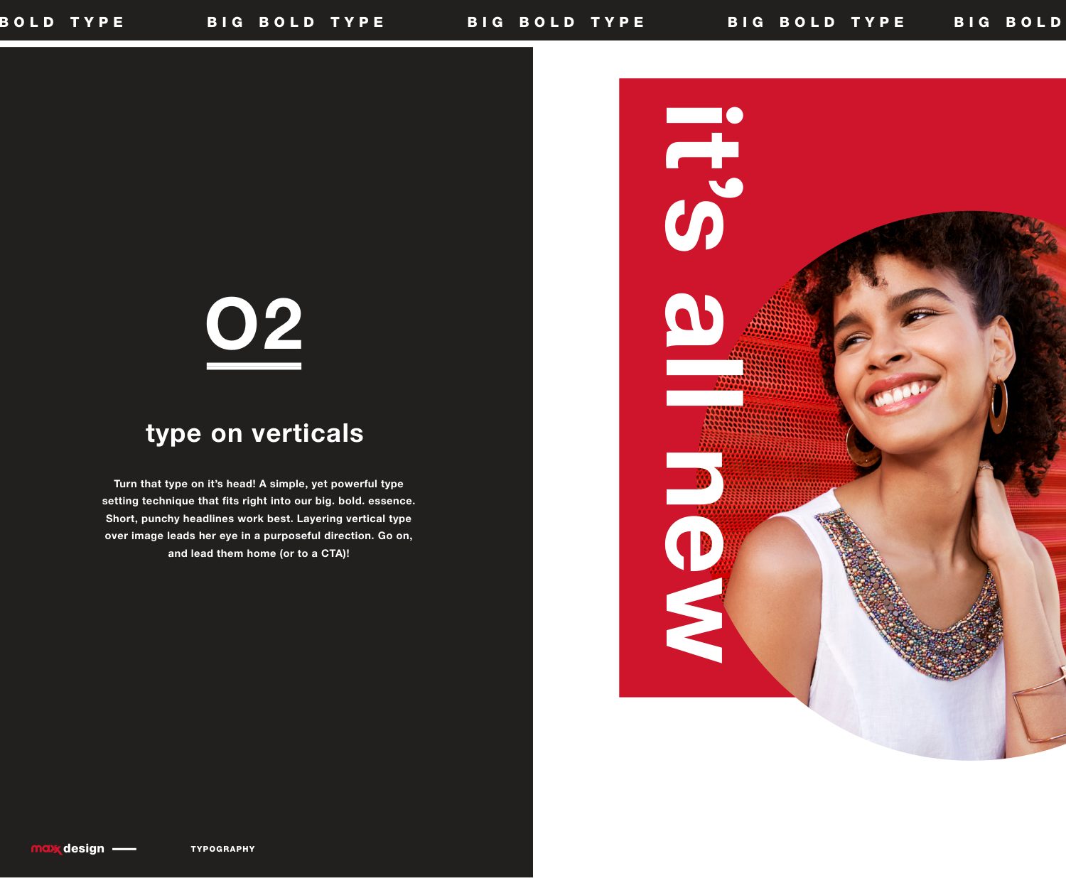
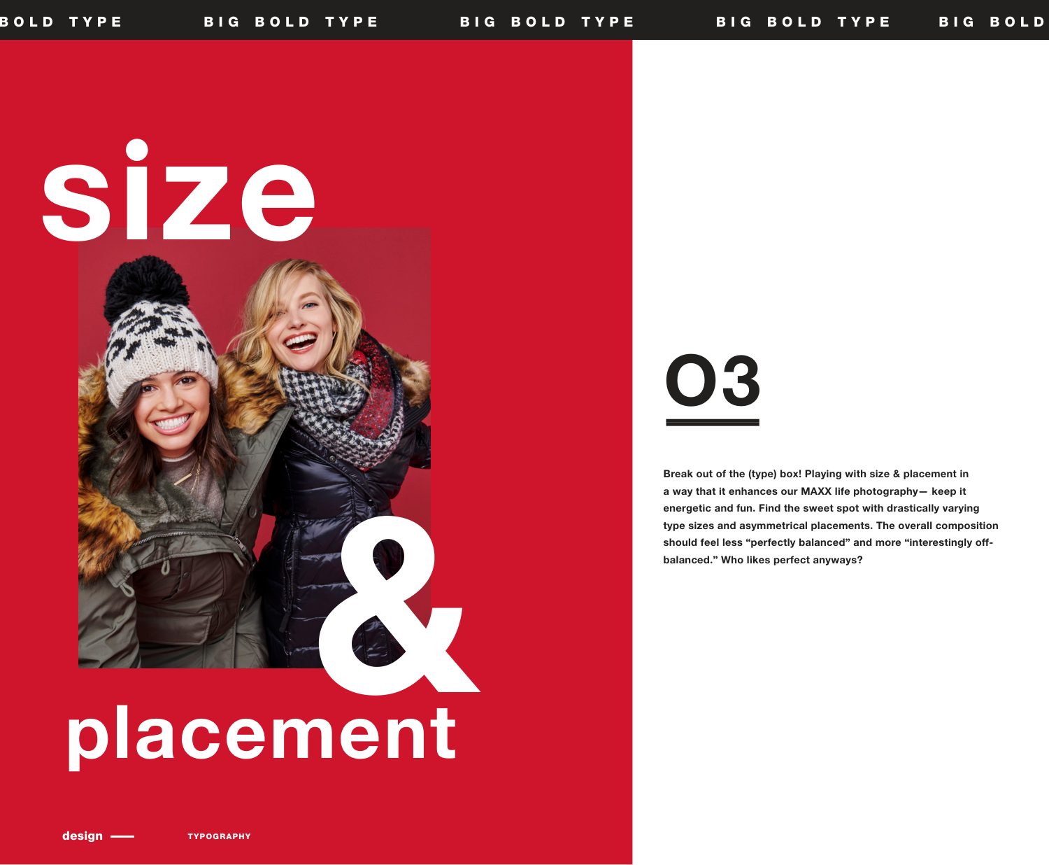
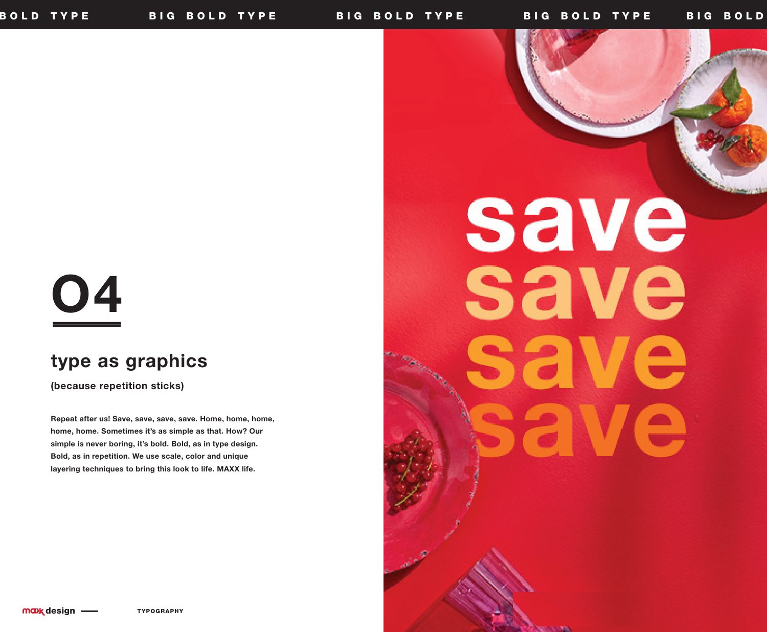
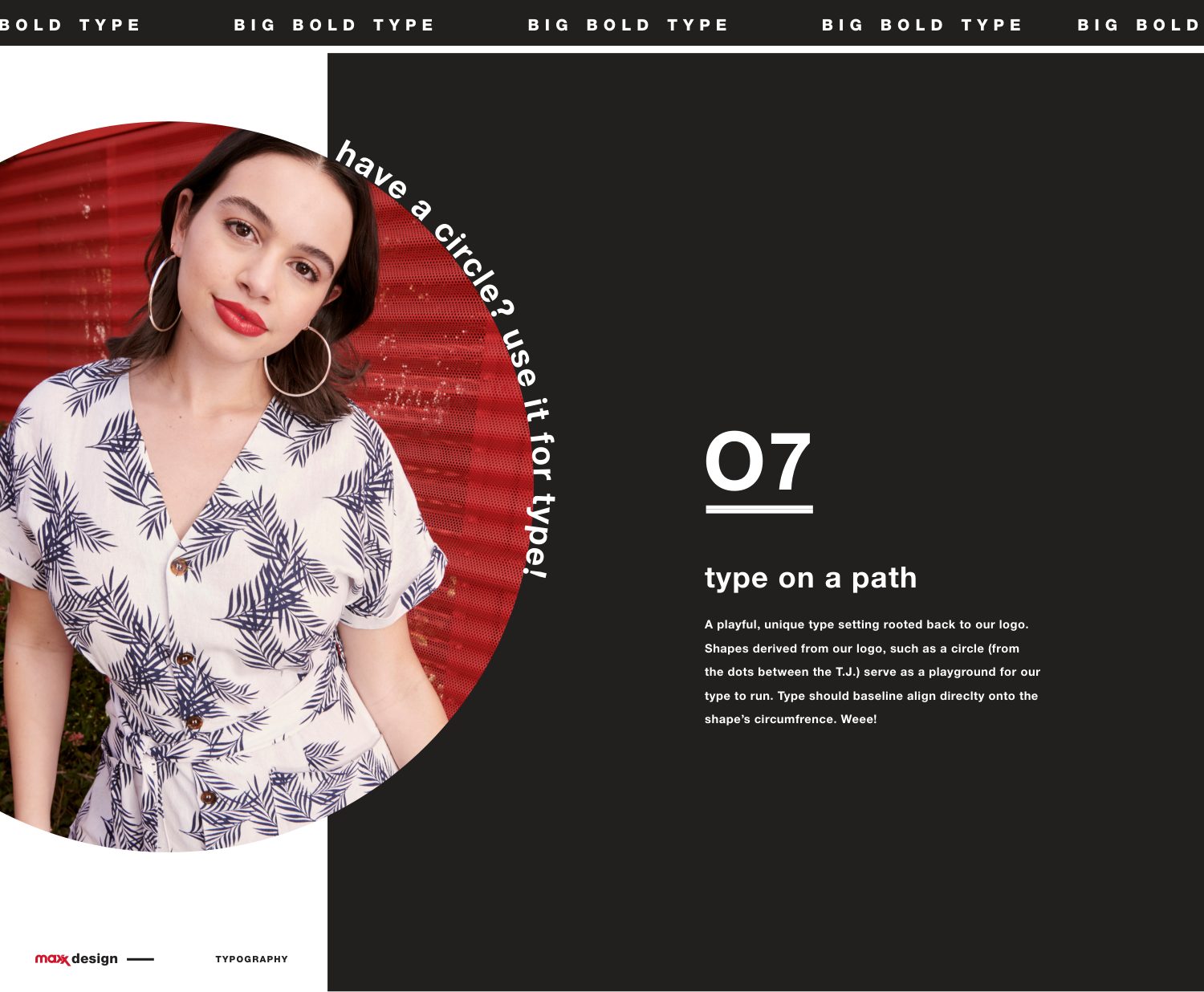
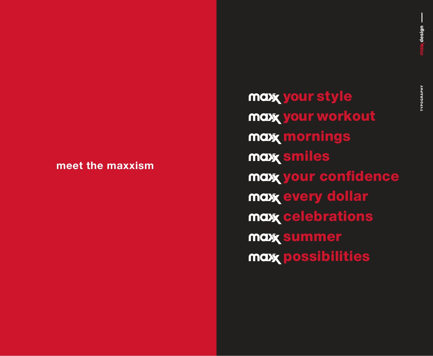
Helvetica Neue as a signature, and eight ways to set it big and bold: bars, verticals, borders, paths and a ticker.

T.J. Maxx Helvetica Neue: consider it our signature Big. bold. colorful. life. Type on verticals Size and placement Type as graphics Type on a path Meet the maxxism

Graphic language

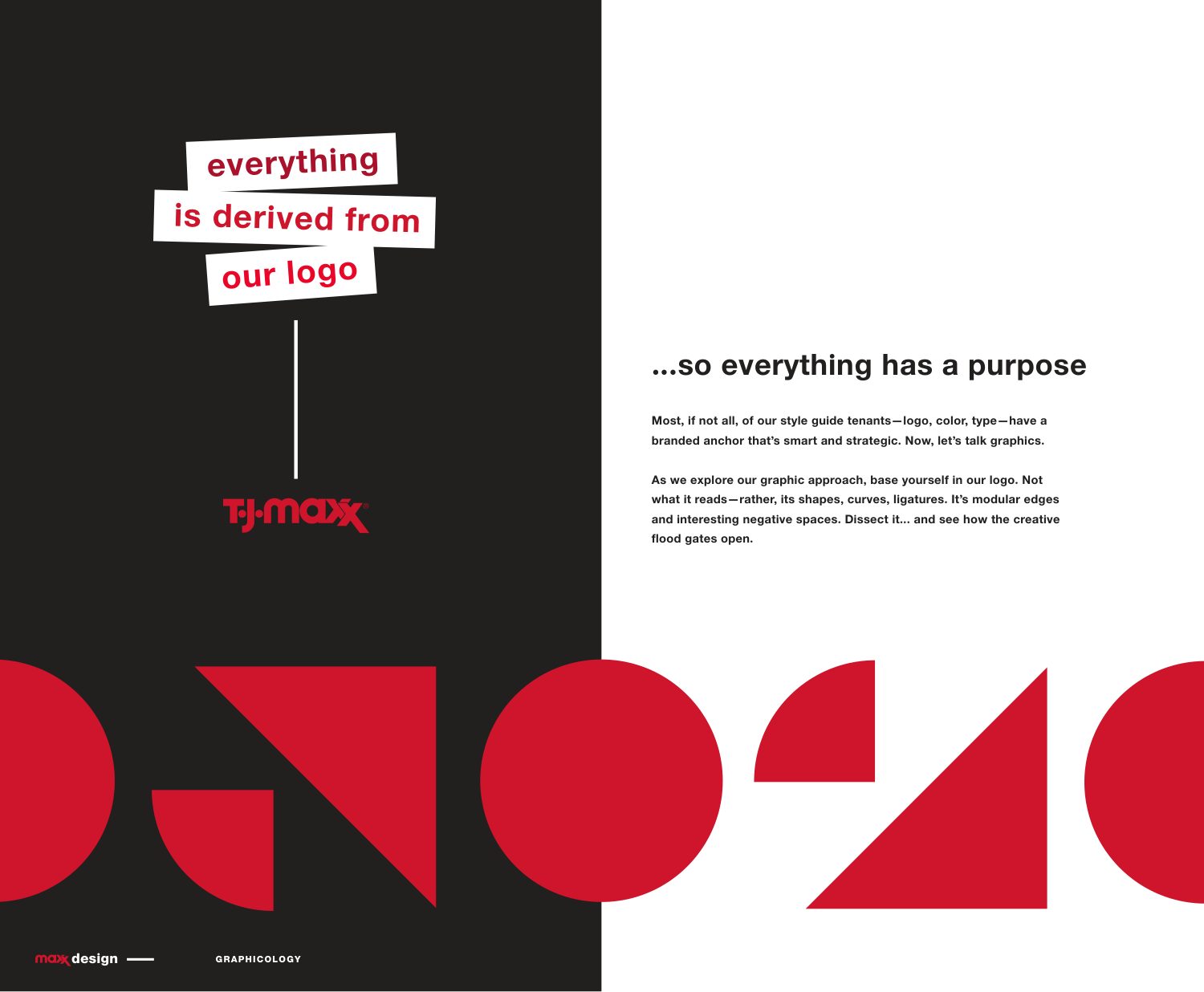
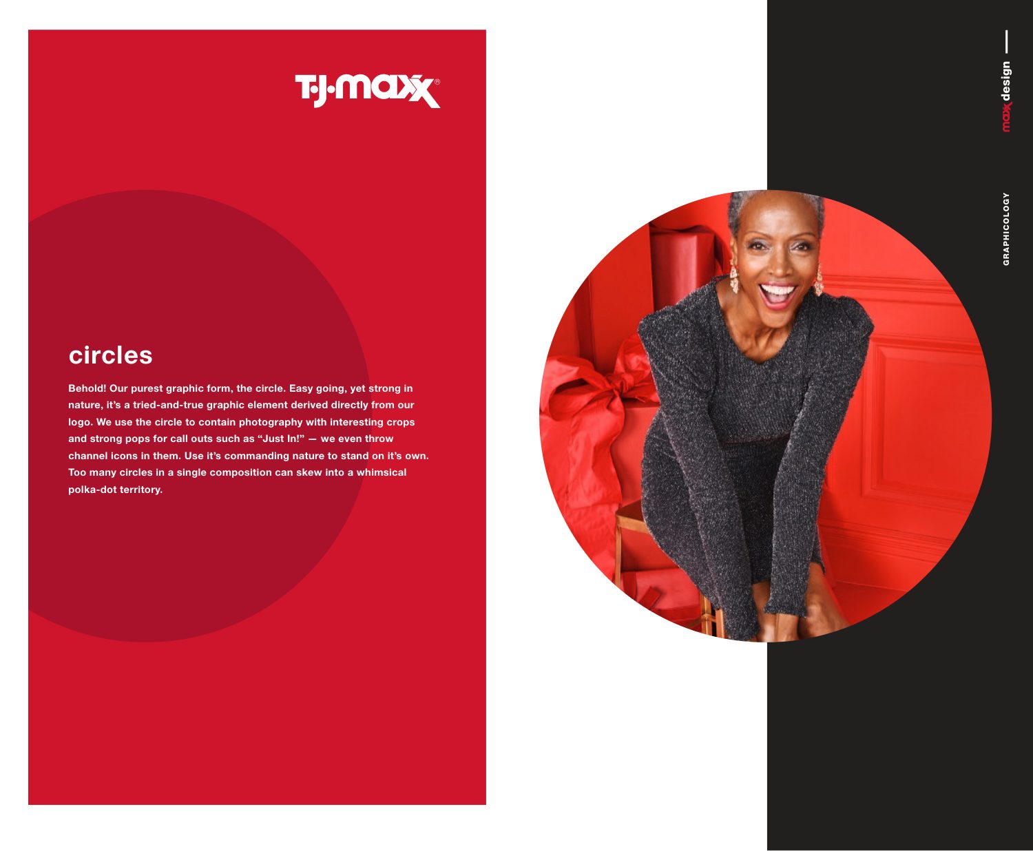
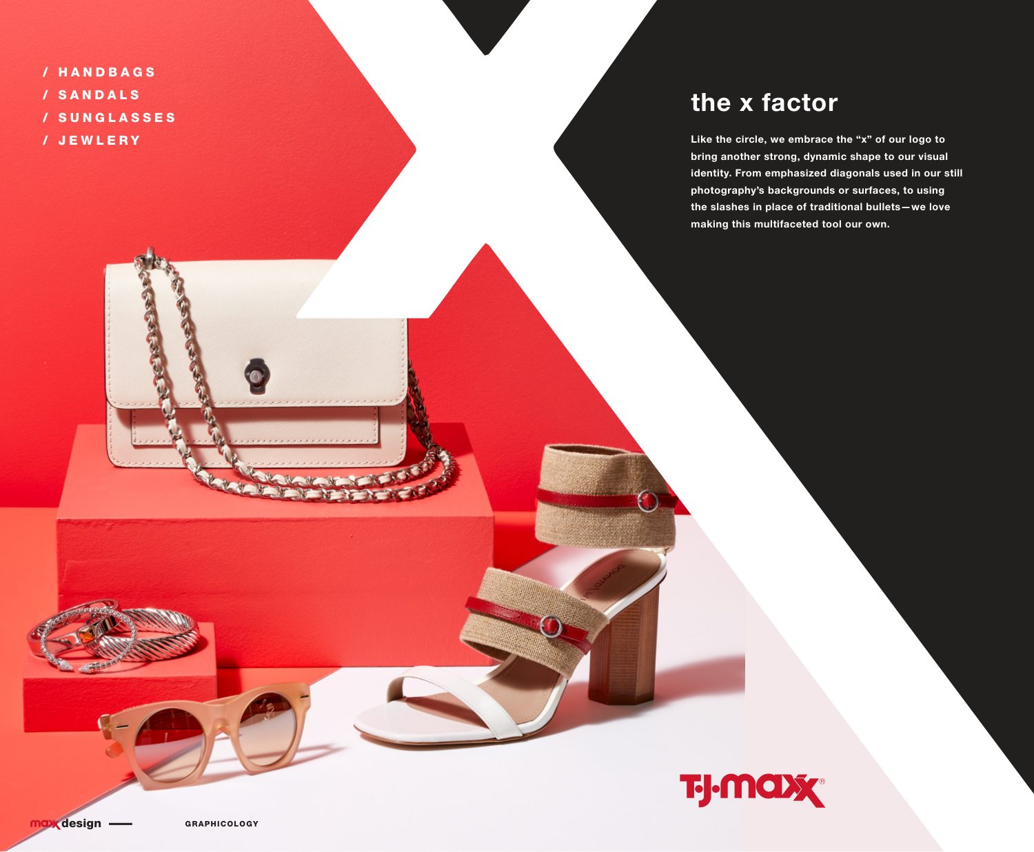
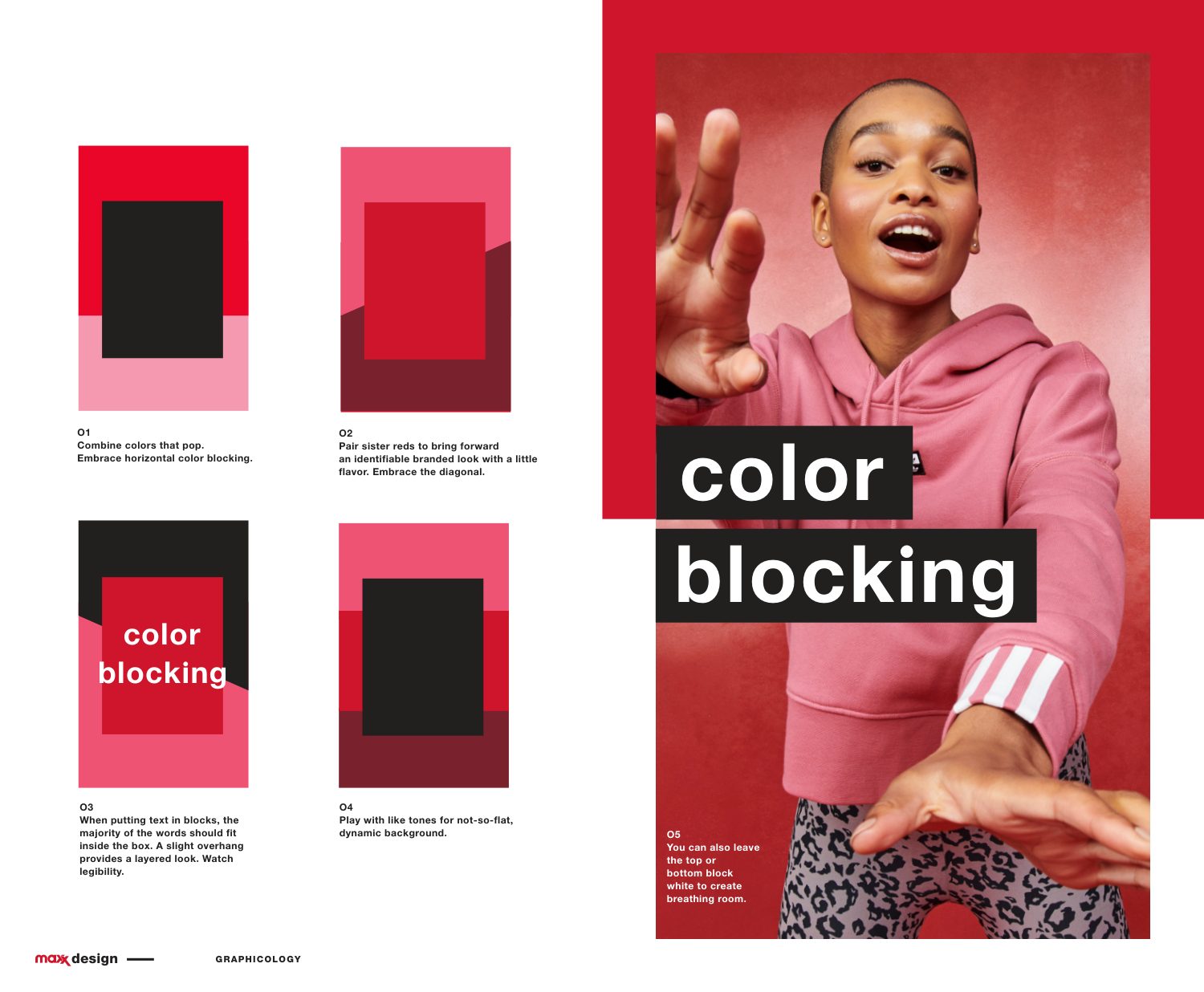
Everything is derived from the logo, so everything has a purpose: the circle from its dots, the X factor from its double X.
Everything is derived from our logo Circles The X factor Color blocking
04

Photography: how it’s seen

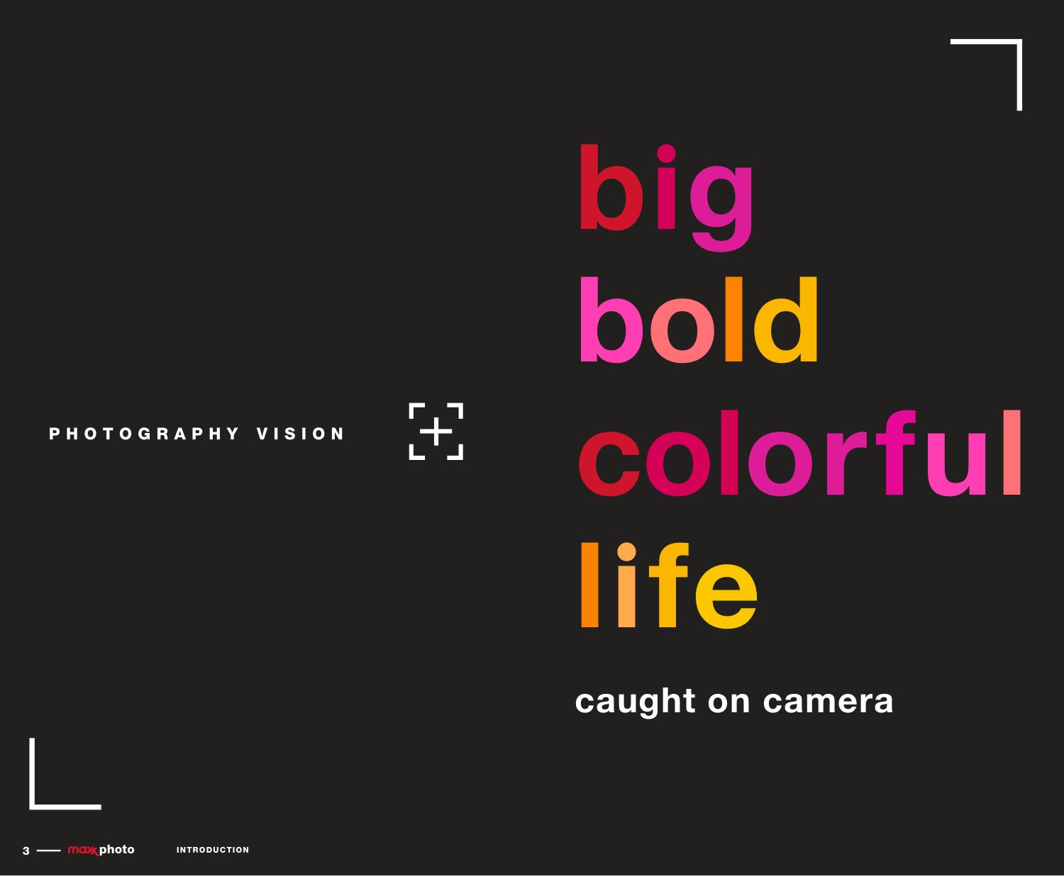
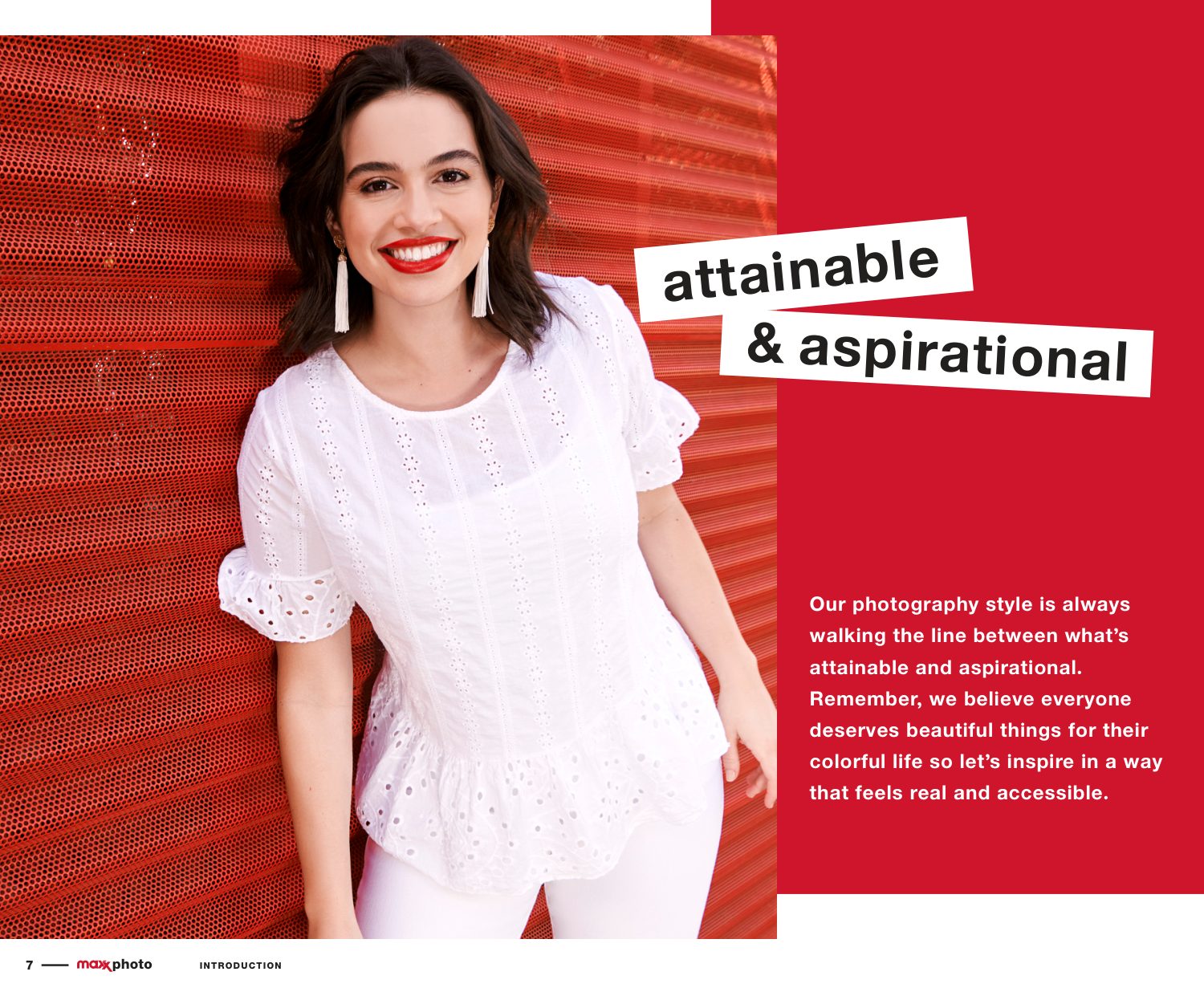
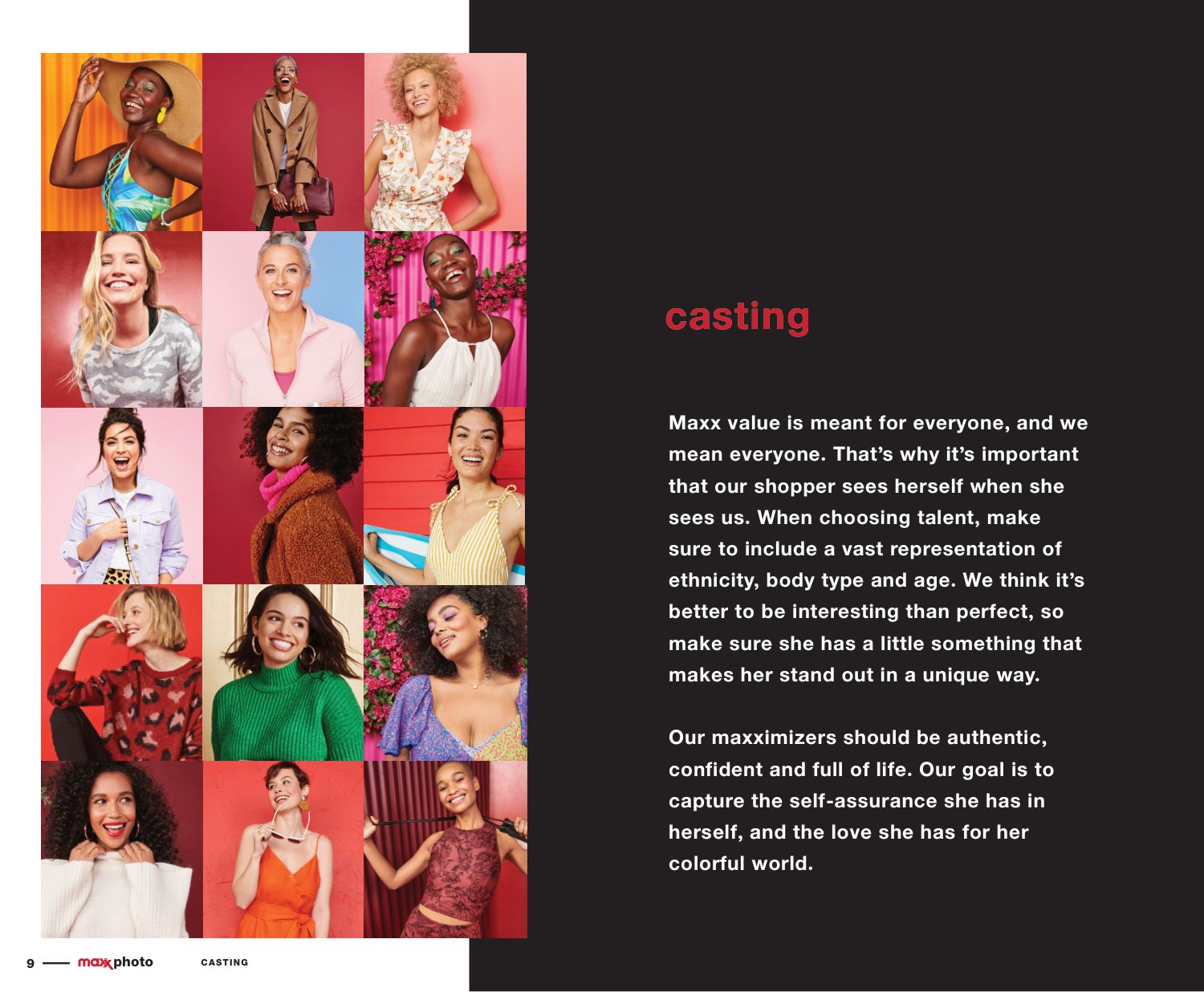
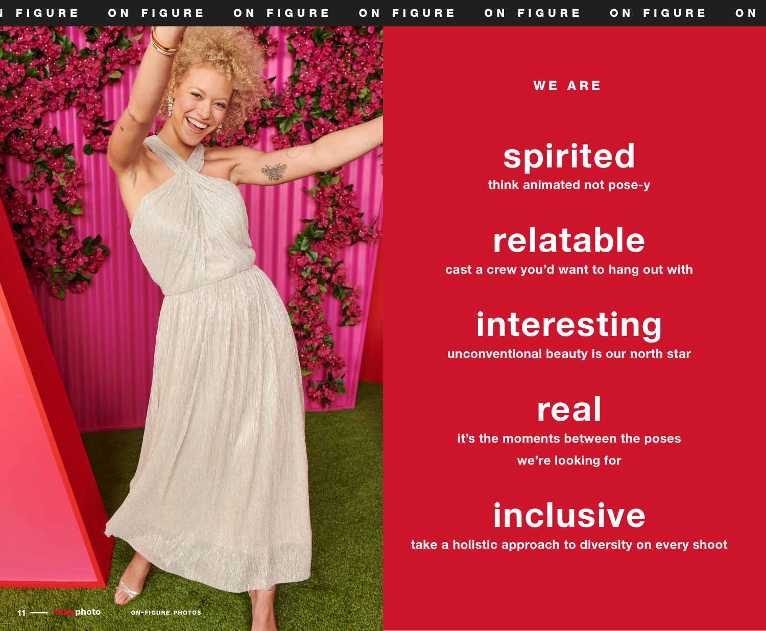
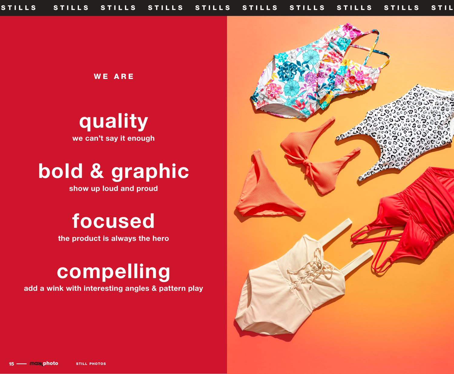
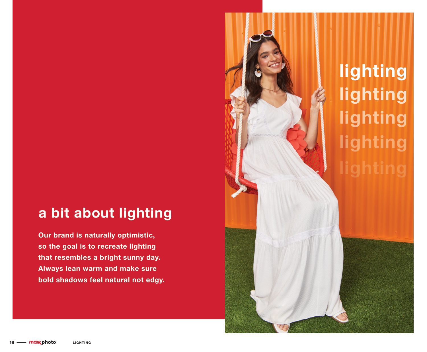
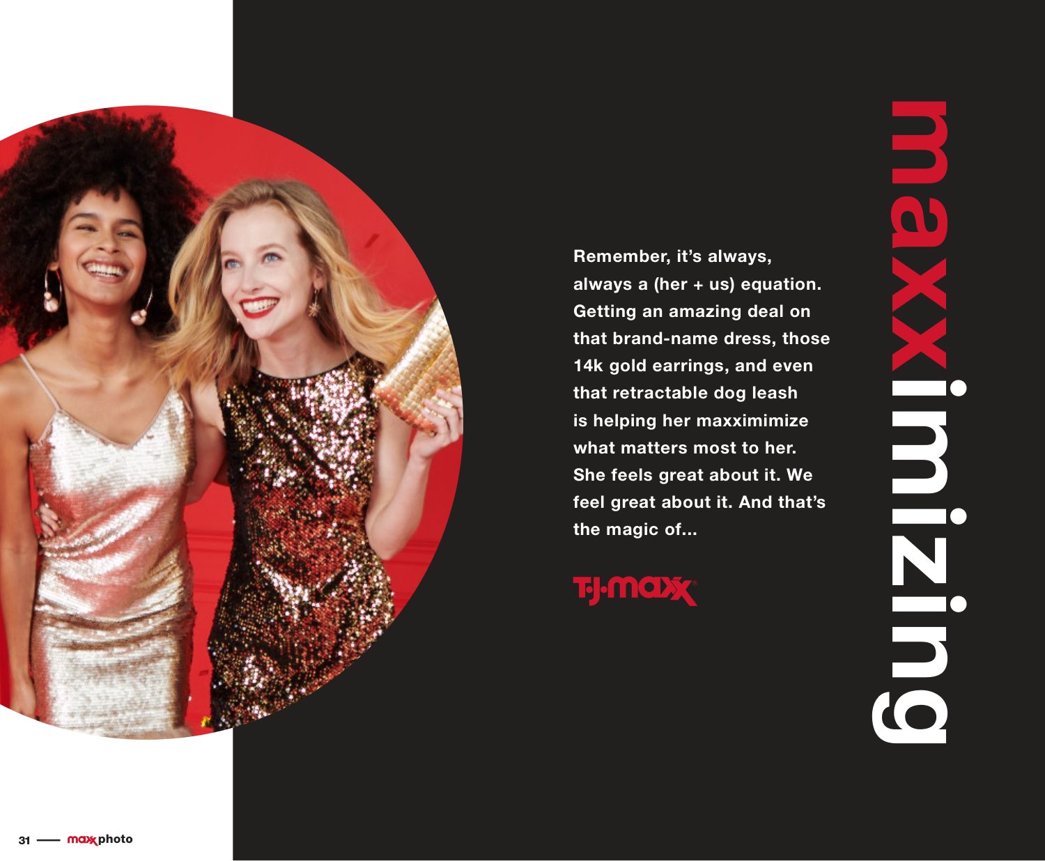
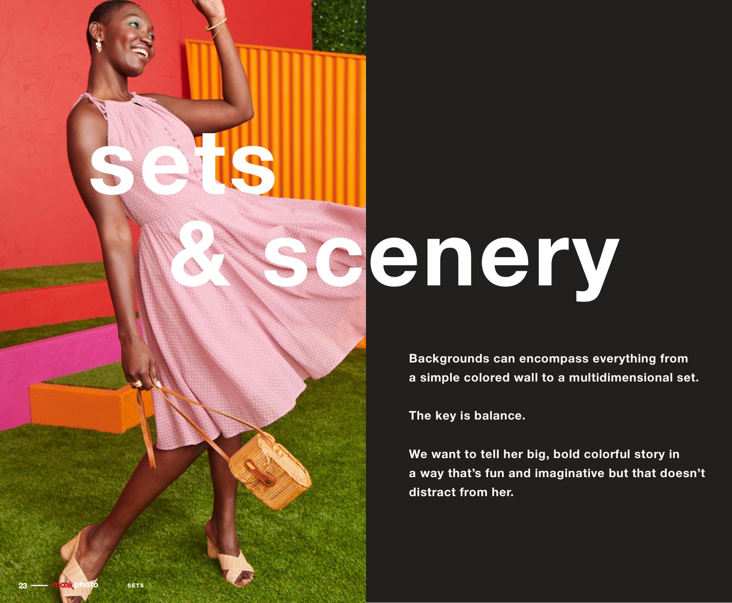
Big, bold, colorful life, caught on camera. One vision for casting, styling, stills, light and sets, so a single shoot could serve stores, site, email and social.
Art direction · Casting · Production standards
Photography vision: big bold colorful life caught on camera Attainable and aspirational Casting On figure: spirited, relatable, interesting, real, inclusive Stills: quality, bold and graphic, focused, compelling Lighting Sets and scenery Maxximizing
05

Pattern: how it’s dressed

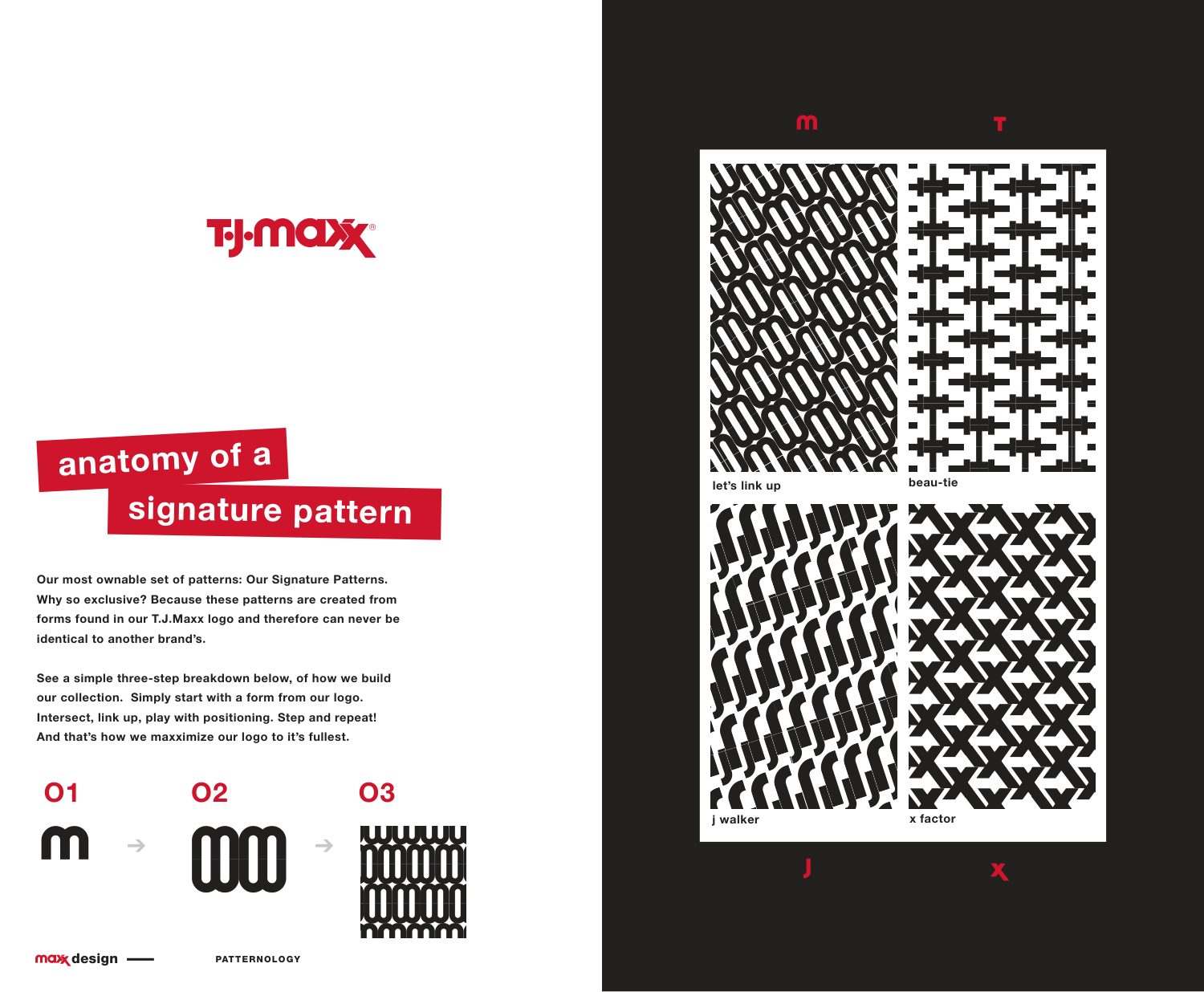
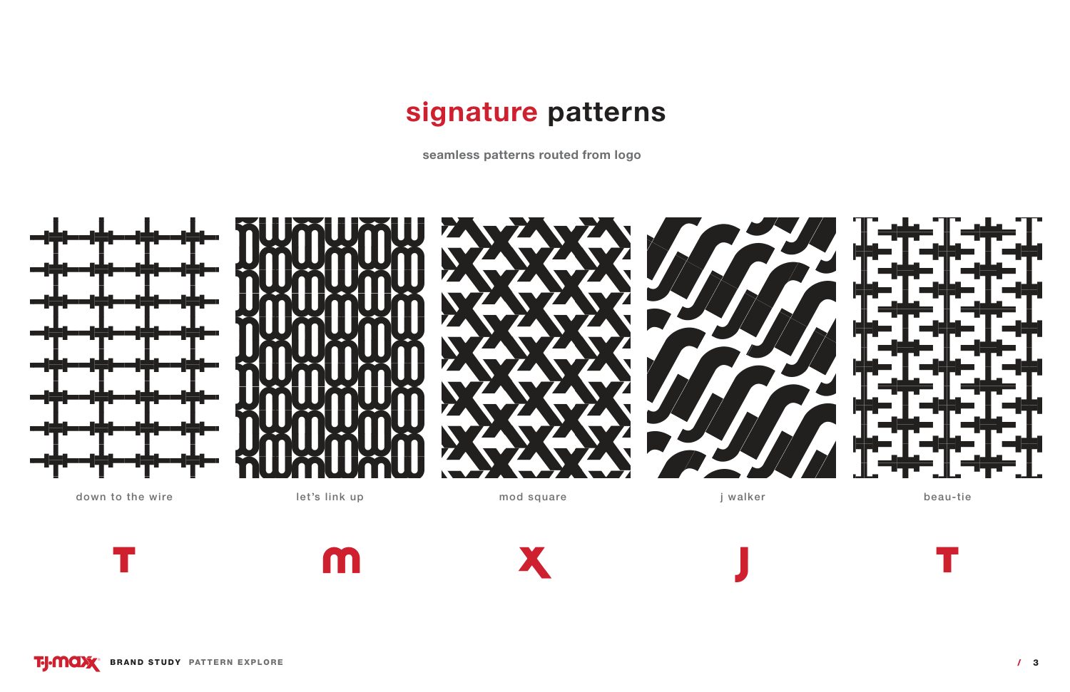
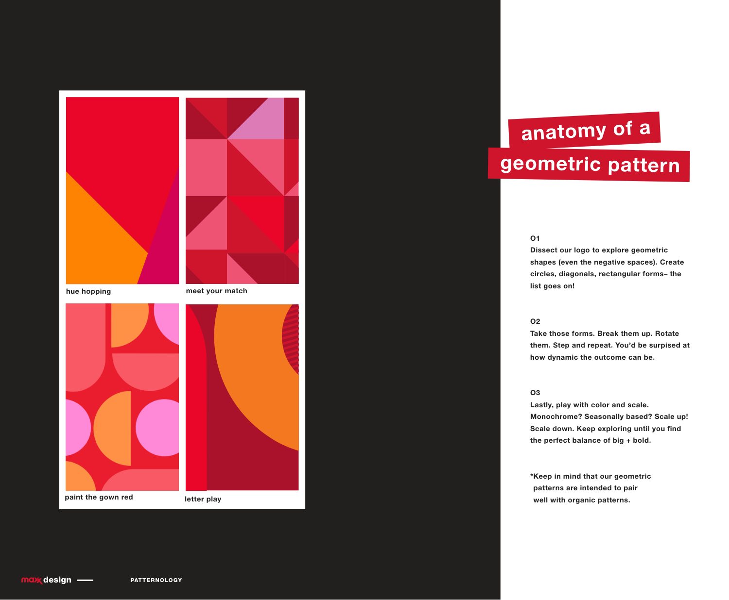
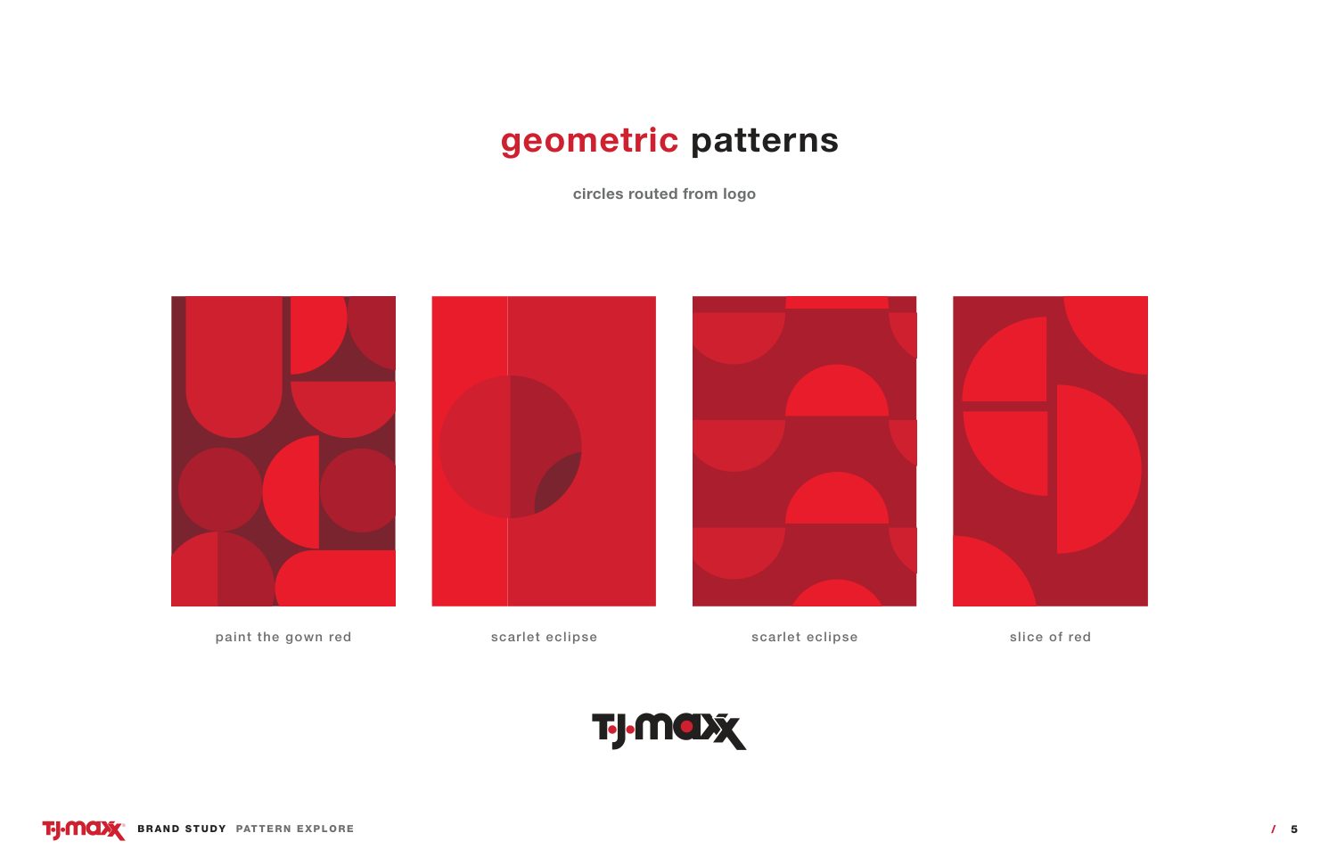
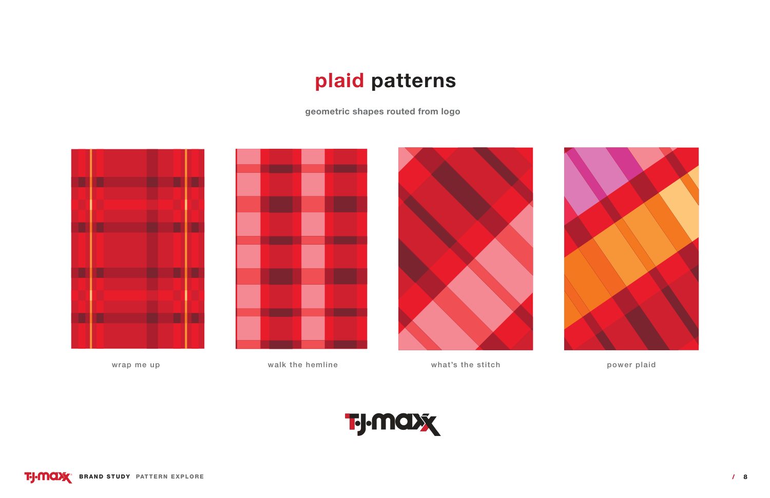
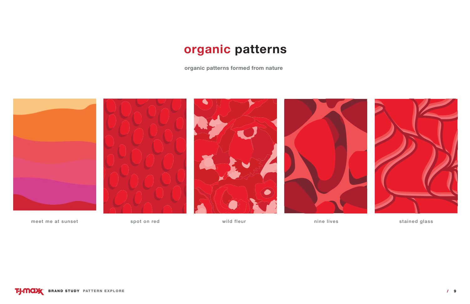
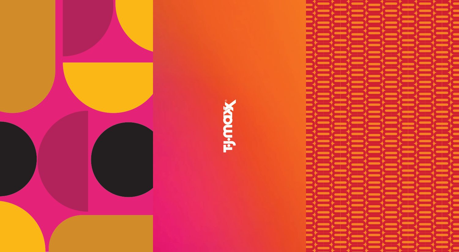
Three families of pattern, signature, geometric and organic, each one drawn out of the letters of the logo.

Brand texture · System thinking
Anatomy of a signature pattern Signature patterns routed from the logo Anatomy of a geometric pattern Geometric patterns Plaid patterns Organic patterns Pattern in use Pattern in use
In the wild

Meet the new tjmaxx.com

The system at work: the 2021 relaunch of the site, in the brand’s own red, type and voice.

One team, one voice, one look, across more than a thousand stores and the website.